|
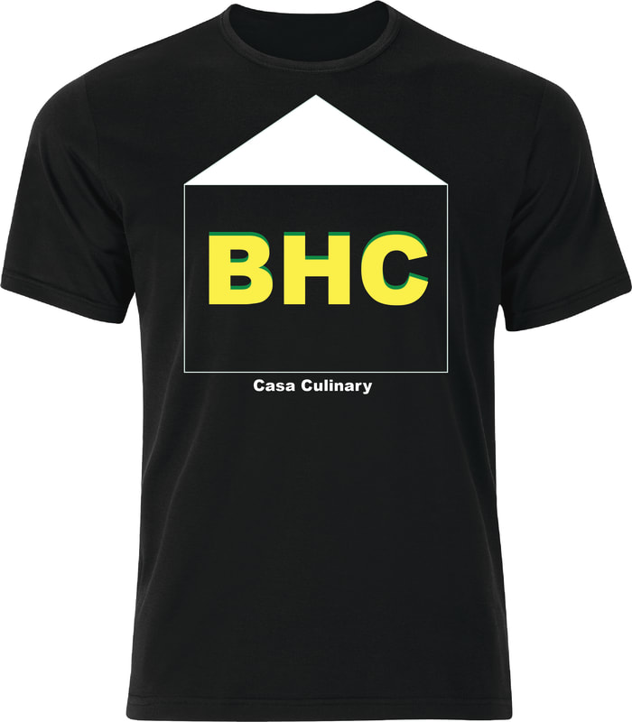
Casa Culinary- Big House Catering
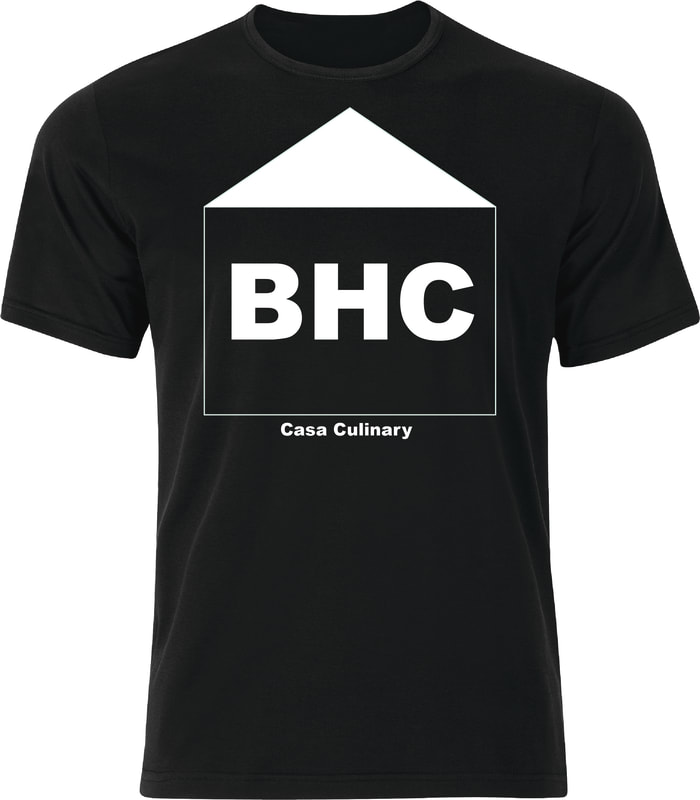
My first step in this project was to download a good, black shirt that I could use as a background.To make the houe outline, I simply used the rectangle tool, and made it white. I then used the pen tool to make a triangle as the makeshift roof of the house. For the text, I wrote "BHC", which stands for, "Big House Catering", and I made it with Gaucho colors- green and gold. I used the classic "Impact" font for the text. I also made a white text version(below). |
|
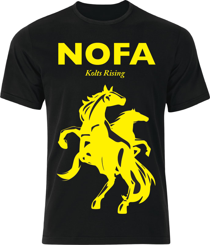
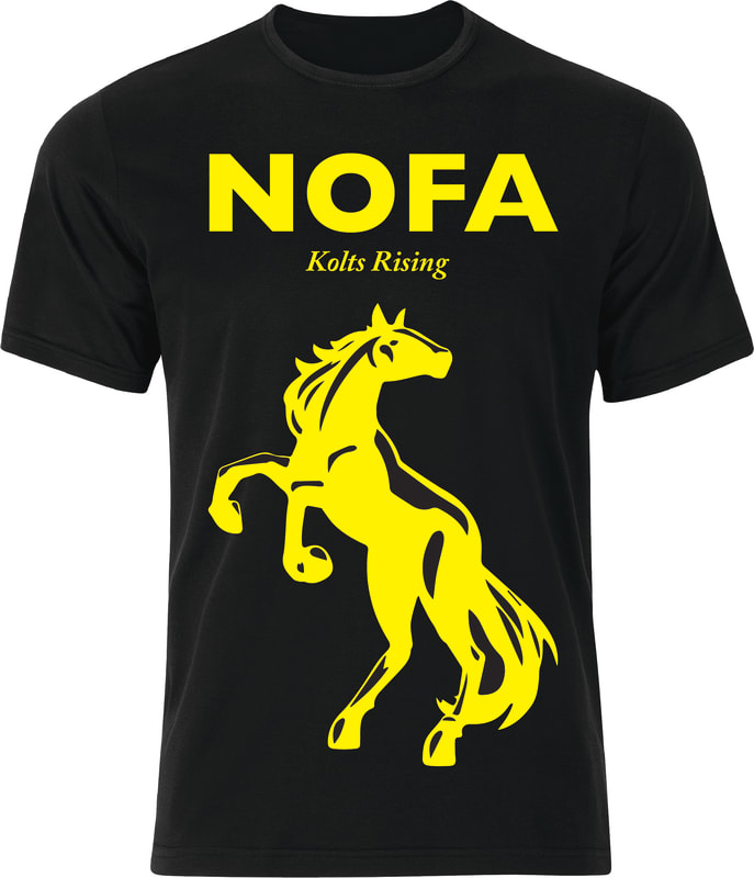
For this customer product, my main goal was to try to make the best looking colt I could. To do this, I took a horse png, loaded it up and image traced it. I image traced it, then expanded it. I then changed the colors of certain parts of the horse. I changed some to yellow and some to black- the Kenilworth colors. I then moved onto text, a simple "NOFA" and "Kolts Rising" in yellow. I made two shirt concepts, one with two horses, and one with just one horse
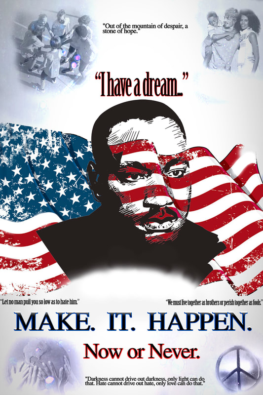
For this poster, I just did a quick representation of what I think of when I hear Martin Luther King Jr. I used proximity by making most of the text grouped in the bottom half. I used hierarchy by making the MLK image pop out and be in the middle. Finally, I used alignment by making the text equally spaced out from each other. In the text, I used some famous quotes from him. In the corners I put some pictures and blended them in. These pictures represent peace and equality and living as one.
|
2019 Holiday Fair
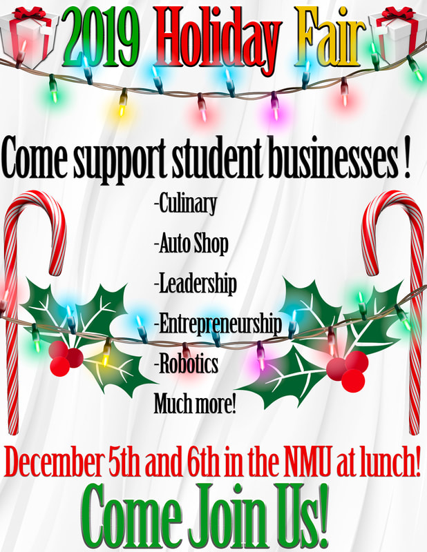
For this graphic I incorporated everything the client wanted, and I also incorporated some stuff of my own. I added some creativity and pop to the graphic, to make it look better and stand out. I used bright, vibrant colors to send a happy, positive message. I also used candy canes, presents, and mistletoe to represent the holidays that are coming up. I also used bevel and emboss on the text to make it look better overall and more stand-out-worthy. I also made sure to not use any images that could make some people feel left out(santa, dreidel, etc) |
|
|
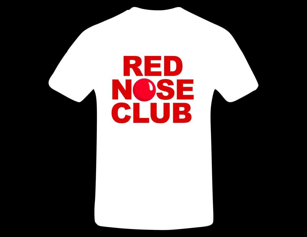
For this client product, I did exactly what they wanted. I used a white T-shirt, and all only red text. I also included the nose from there logo used it as the 'O' in "nose." I used all caps with a simple typeface, and made sure everything was exactly evenly spaced.
|
|
|
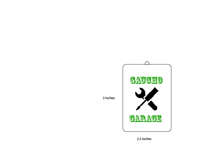
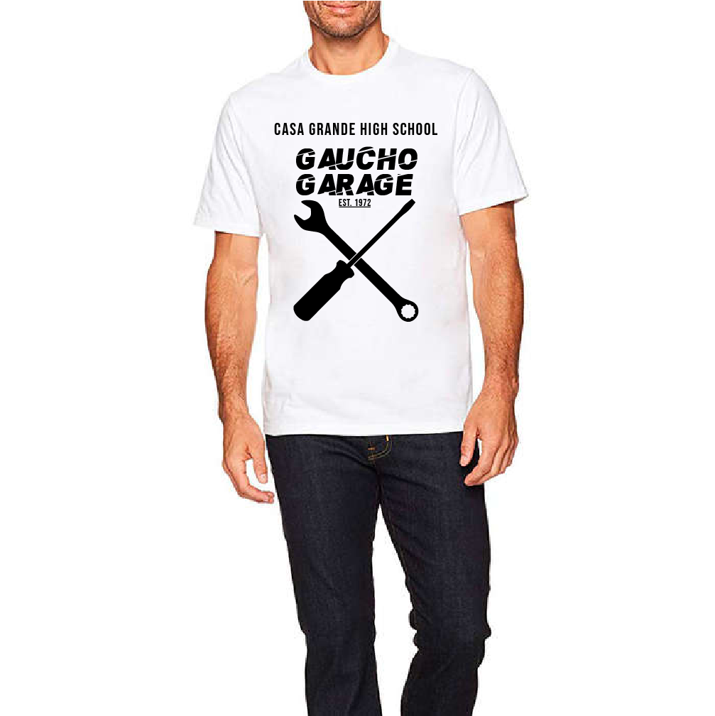
This project was very simple. All we had to do was create a sort of chain for the gaucho garage. I used a vector image of a screwdriver and wrench,two tools you would use in the gaucho garage.
|
|
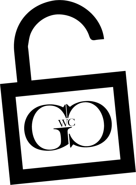
This project was quite fun for me. We had to create a logo idea for Graphic Communications Workforce Coalition. I used an unlock symbol to represent what can be done when incorporating new members or organizations. I also had the letters of the logo symbolize an infinity sign, to represent what can get done when you work together.
|
|
|
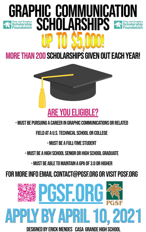
This project, I created a poster to help advertise scholarships given out by the Print and Graphics Scholarship Foundation. I included everything I needed to: Their logo, website, email, apply date, and the idea of the scholarship money. I tried to make the scholarship money stand out so viewers will first see this when walking by or viewing the poster. I used a pink and blue color theme to communicate the important ideas.
|
|
|
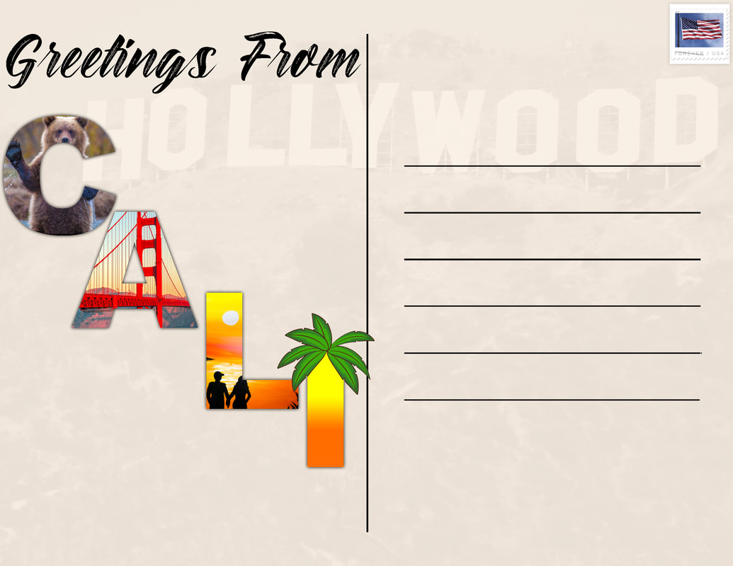
The goal for this project was to make a piece of mail. I chose to create a postcard from our home state of California. I hand drew some lines with the rectangle tool to create the lines where someone would write their message on. I included a stamp in the top right corner. For the lettering, I used layer clipping masks with images that represent California. I put a picture of the hollywood sign in the background and turned down the opacity so you would notice it, but not before the "CALI" lettering.
|
|
|
For this project, I focused on only using black and white colors, so it stays simple. I loaded in a png of some tools and traced them in Illustrator, to make it high quality.
|
|